
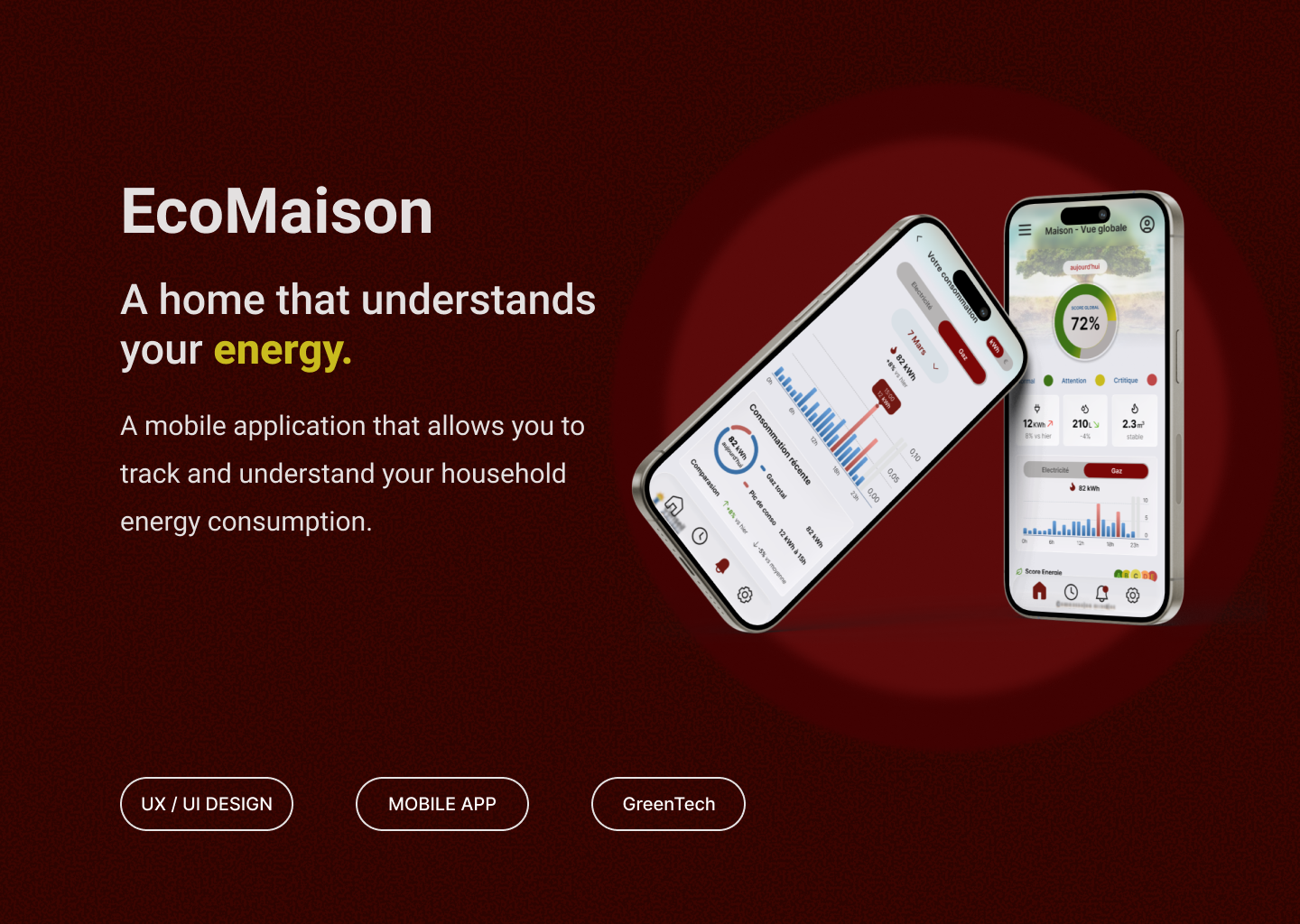
EcoMaison
Mobile App — Energy Consumption
Project Overview
EcoMaison is a mobile application concept designed to visualize and help users understand a home’s energy consumption.
This project was completed as part of an UX/UI design exercise during my training, with the goal of transforming a textual wireframe into a clear and intuitive mobile interface.
Role: UX/UI Designer
Tools : Figma
Type : exercice de conception
Problem
Domestic energy data is often complex and difficult for users to interpret.
Without clear visualization, it becomes challenging to understand:
- daily energy consumption
- usage peaks
- the impact of everyday habits
UX Objective
The goal of the project was to design an interface that would:
- quickly visualize energy consumption
- help users understand daily variations
- encourage more responsible energy behavior
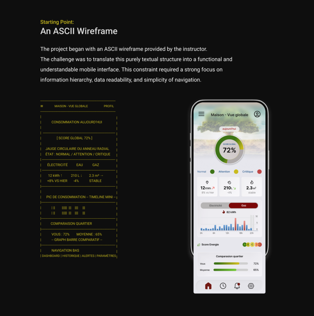
Design Approach
The interface was designed using a minimalist approach to ensure clarity and easy access to key information.
Several visual elements were introduced:
- a global energy score
- a circular gauge indicating consumption status
- a consumption timeline
- a comparison with neighborhood averages
This visual hierarchy allows users to quickly assess their energy situation at a glance.
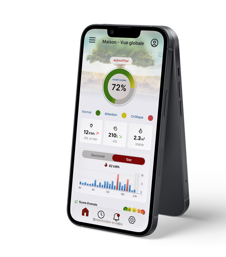
Final Interface
The final interface presents an overview of the home through key indicators:
- Electricity
- Water
- gas
Accompanying charts make it easy to identify consumption variations at a glance.
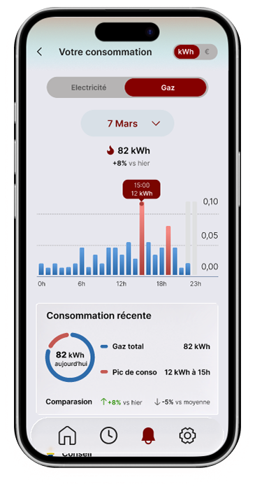
Experience Extension
To go beyond the initial exercise, I designed an additional screen to allow deeper exploration of energy consumption.
This screen introduces an analytical view of energy usage by source, helping users better understand how their consumption evolves throughout the day.
It enables users to:
- select an energy source (electricity / gas)
- view hourly consumption data
- identify peak usage periods
- compare data with the previous day
This detailed view helps users gain deeper insight into their consumption habits.
Prototype
An interactive prototype was created in Figma to test
navigation and overall user experience.
Conclusion
This project explores the design of a mobile interface that simplifies the visualization of household energy consumption.
The UX approach focused on data clarity, information hierarchy, and creating a smooth, intuitive user experience.